Tutorial for tbSTATIS
tbSTATIS_vignette.RmdIntroduction
This tutorial introduces the tbSTATIS package and walks through an example of using tbSTATIS to classify tuberculosis (TB) disease severity.
First we install tbSTATIS with:
# install.packages("devtools")
devtools::install_github("samalatesta/tbSTATIS")
If we want the results to match this tutorial, we first set the seed to match:
set.seed(0)We then load the package by running:
library(tbSTATIS)
library(dplyr)
#>
#> Attaching package: 'dplyr'
#> The following objects are masked from 'package:stats':
#>
#>     filter, lag
#> The following objects are masked from 'package:base':
#>
#>     intersect, setdiff, setequal, union
We often collect information from multiple data sources such as symptoms, sputum culture, sputum smear microscopy, and chest radiography during the process of diagnosing persons with TB. While this information is used to inform TB diagnosis, it is also strongly correlated with TB disease severity. Common approaches to categorizing TB severity include using smear microscopy or cavitation on chest x-ray alone offering only a binary view of the TB disease spectrum.
We developed the tuberculosis SeveriTy Assessment Tool for Informed Stratification (TB-STATIS) as a data-driven approach to classifying TB disease severity that integrates information from multiple data sources at time of TB diagnosis to assign individuals to a predicted disease severity class. TB-STATIS only requires cross-sectional data as input and does not require knowing a clinical outcome as part of the classification process.
TB-STATIS Terminology
| Term | Definition |
|---|---|
| Clinical Measure | Information collected during TB diagnosis that is associated with disease severity. ex: symptoms, chest-xray, etc |
| Clinical State | Each clinical measure has a set of clinical states. ex: The clinical measure cavitation can have two states “no cavities” or “cavities present”. The minimum number of states per clinical measure is 2. |
| Disease Sequence | The estimated number of disease classes and the clinical states belonging to each class. |
| Predicted Disease Severity Class | Disease severity class assigned to each individual after estimating the disease sequence. |
Analysis Workflow
We recommend the following workflow as a general guide for analyzing
data with tbSTATIS. Functions required are listed in parentheses:
1. Visualize clinical measures (plot_states())
2. Estimate model (fit_STATIS())
3. Check likelihood ascent plot (plot_likes())
4. Estimate model for m bootstrap resamples (bootstrap_seq())
5. Visualize uncertainty by making positional variance diagram
(pvd())
6. Obtain predicted disease class for each observation and plot
distribution (pred_class() and plot_class())
Example Data Set
We provide a synthetic data set TBData in the tbSTATIS package. We will use this data set to walk through an example of analyzing data with tbSTATIS to classify TB disease severity.
Description
In the table below, we provide a description of each variable included in the data set.
| Variable | Description |
|---|---|
| Index | Unique row identifier |
| class | True disease class |
| X1 | Indicator for state 1 in clinical measure 1 |
| X2 | Indicator for state 1 in clinical measure 2 |
| X3 | Indicator for state 2 in clinical measure 2 |
| X4 | Indicator for state 1 in clinical measure 3 |
| X5 | Indicator for state 2 in clinical measure 3 |
| X6 | Indicator for state 1 in clinical measure 4 |
| C1 | Binary covariate |
| C2 | Continuous covariate |
The data set contains 250 rows where each row represents data observed on a unique individual. There are 10 columns in the data set. For each individual, we record the value for 6 clinical states corresponding to 4 clinical measures, and we include 2 covariates. The motivation for including covariates is we are often interested in associations between different variables with disease severity. Each covariate was simulated to be positively correlated with disease class.
data(TBData)
str(TBData)
#> 'data.frame':    250 obs. of  10 variables:
#>  $ Index: int  1 2 3 4 5 6 7 8 9 10 ...
#>  $ class: num  0 1 2 4 2 2 0 3 0 0 ...
#>  $ X1   : int  0 0 0 1 0 0 0 1 0 0 ...
#>  $ X2   : int  1 1 1 1 1 1 0 1 0 0 ...
#>  $ X3   : int  0 0 0 1 0 0 0 1 0 0 ...
#>  $ X4   : int  0 0 0 1 1 1 0 0 0 0 ...
#>  $ X5   : int  0 0 1 1 0 0 0 0 0 0 ...
#>  $ X6   : int  0 1 1 1 1 1 0 1 0 0 ...
#>  $ C1   : int  0 0 1 1 1 1 0 1 1 0 ...
#>  $ C2   : num  1.455 3.3 1.547 4.263 -0.278 ...
True disease sequence
Here is the ground truth sequence of states that was used to generate TBData. There are 4 disease classes. States X2, X6 belong to class 1:
| Clinical State | Disease Class |
|---|---|
| X1 | 3 |
| X2 | 1 |
| X3 | 3 |
| X4 | 2 |
| X5 | 4 |
| X6 | 1 |
Data Summary
Below we provide the first 6 rows of our example data set. The third observation in this data set is in disease class 2. States X2, X5, and X6 have occurred as indicated with the value 1, and states X1, X3, and X5 have not occurred which is indicated by the value 0. We generated this data set setting p to 0.9 so each individual’s data may not align perfectly with their true disease class. For example, observation 3 and 5 are both in class 2. Given the ground truth sequence, we would expect X2, X4, and X6 to all have the value 1. For observation 5 this is true, but for observation 3, X4 is equal to 0 and instead X5 is equal to 1.
head(TBData)
#>   Index class X1 X2 X3 X4 X5 X6 C1     C2
#> 1     1     0  0  1  0  0  0  0  0  1.455
#> 2     2     1  0  1  0  0  0  1  0  3.300
#> 3     3     2  0  1  0  0  1  1  1  1.547
#> 4     4     4  1  1  1  1  1  1  1  4.263
#> 5     5     2  0  1  0  1  0  1  1 -0.278
#> 6     6     2  0  1  0  1  0  1  1  2.363
Here is the distribution of disease class. We can summarize true disease class because we are using a simulated data set. We simulated disease class using a uniform distribution, so we expect all classes to be approximately equally present in the data. Notice here we have a disease class 0 whereas in our true disease sequence above we did not. This is because class 0 is equivalent to an individual being in the earliest state for each clinical measure.
prop.table(table(TBData$class))
#>
#>     0     1     2     3     4
#> 0.236 0.208 0.164 0.160 0.232
Here are the distributions for each covariate.
prop.table(table(TBData$C1))
#>
#>     0     1
#> 0.436 0.564
fivenum(TBData$C2)
#> [1] -1.8160  0.7800  1.5345  2.4420  4.8320
Example analysis
Visualize clinical states
Prior to fitting the model, it is good practice to first visualize the data we are using. We can plot our data using the plot_states function. This function first calculates the frequency of each state occurring and orders the states from most frequent to least frequent. The ordered states are the expected disease sequence for the data set as an accumulation of states within each clinical measure should correspond to more severe disease classes. We then sort observations by the ordered states. We then plot each observation to visualize how well the data follow the expected disease sequence. The x-axis corresponds to observations after sorting and the y-axis corresponds to clinical states ordered by frequency. Blue indicates the state has occurred and white indicates the state has not occurred. If our data aligns well with the expected disease sequence, we expect the top left area of the plot to be mostly white and the bottom right to be consistently blue.
We present the plot from running the plot_states function with TBData. The y axis is ordered as X6, X2, X4, X1, X3, X5. This aligns with our ground truth sequence where X2, and X6 are in class 1 followed by X4 inc class 2, then X1 and X3 in class 3 and finally X5 in class 4. We see our data align well with the ground truth sequence overall with few states occurring in the upper left hand portion of the plot. This is a result of us using a value of .9 for all clinical states when we simulated our data set. If p was lower, we would expect to see more variation.
plot_states(TBData, id.var="Index", state.vars=c("X1", "X2", "X3", "X4", "X5", "X6"))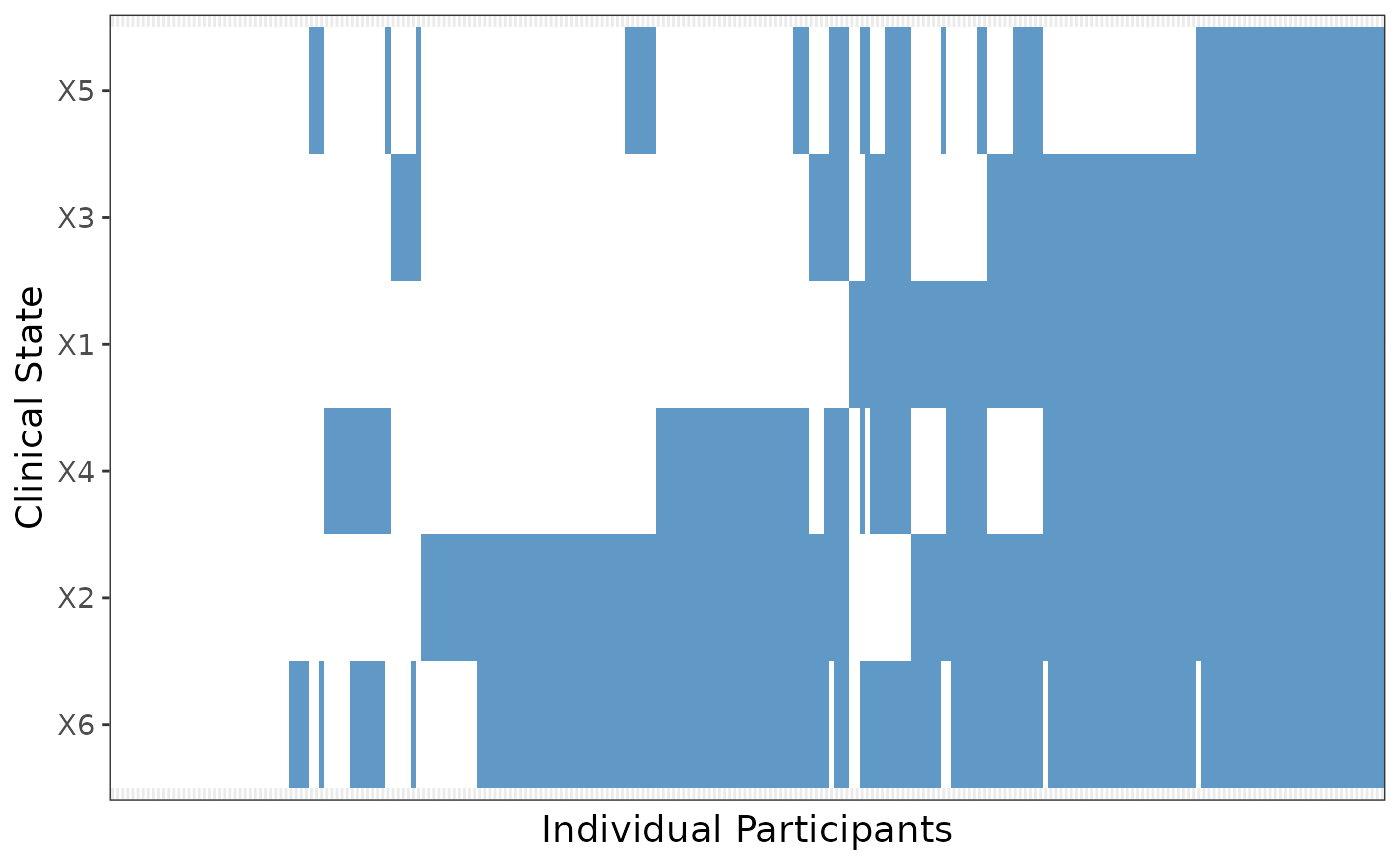
Estimate model
We fit TB-STATIS using the fit_STATIS function. Prior to running the model, the data set should be formatted such that each clinical state has a recorded value of 1 to indicate the clinical state has occurred or 0 otherwise. If there are any observations with missing data they are excluded prior to model fitting. We require the user to also input a data frame that provides the set of clinical states for each clinical measure and the clinical state that corresponds to a column name in the data set used to fit the model.We provide the information data frame for TBData that we will use to fit the model as an example. We must also specify a value of p for each state.
measure_info <- data.frame(clinical_measure=c("measure1", "measure2", "measure2", "measure3", "measure3", "measure4"),clinical_state = c(1,1,2,1,2,1), state_name=c(c("X1", "X2", "X3", "X4", "X5", "X6")))

print(measure_info)
#>   clinical_measure clinical_state state_name
#> 1         measure1              1         X1
#> 2         measure2              1         X2
#> 3         measure2              2         X3
#> 4         measure3              1         X4
#> 5         measure3              2         X5
#> 6         measure4              1         X6
The fit_STATIS function returns a list. One object in the list called ml_seq is a data frame with 4 columns. The ‘sub’ column in this data frame is the maximum likelihood sequence. We present the maximum likelihood sequence for TBData. We ran the model with only 3 start points and 250 iterations but in practice the minimum number of start points should be 10 with at least 2000 iterations. From this output, the maximum likelihood sequence is ({X6, X2}, {X4}, {X1, X3},{X5}) which is the same as our ground truth sequence.
model1 = fit_STATIS(data=TBData[,c(3:8)], p_vec=c(.9,.9,.9,.9,.9,.9), clinical_info=measure_info, nstart=3,initial_iter= 250)

#print maximum likelihood estimate
print(model1$ml_seq)
#>        bio event var_name pos order sub
#> 1 measure2     1       X2   2     1   1
#> 2 measure4     1       X6   6     2   1
#> 3 measure3     1       X4   4     3   2
#> 4 measure1     1       X1   1     4   3
#> 5 measure2     2       X3   3     5   3
#> 6 measure3     2       X5   5     6   4
Likelihood ascent
After estimating the model, we assess model convergence by plotting the likelihood ascent for each start point using the plot_likes function. The log-likelihoods for all iterations can be accessed from the saved model object. For example, we saved our model as model1 above and we can call model1$loglikes which is a dataframe that contains all log-likelihoods across all iterations and start points. We present the likelihood ascent plot for estimating the model with TBData. All initializations do not converge to the same log-likelihood because we only used 250 iterations to shorten computational time for this tutorial. When running TB-STATIS with real data, it is likely the model will not converge until at least 2000 iterations. When fitting the model we recommend checking convergence by plotting the likelihood ascent and if convergence is very slow or does not occur then to increase the total number of iterations and/or start points and rerun the model.
#first 6 rows of loglikes data frame
head(model1$loglikes)
#>   start iter      like
#> 2     1    1 -998.7502
#> 3     1    2 -965.6635
#> 4     1    3 -924.7706
#> 5     1    4 -775.9737
#> 6     1    5 -775.9737
#> 7     1    6 -775.9737

#plot log-likelihoods for all iterations and start points
plot_likes(model1$loglikes)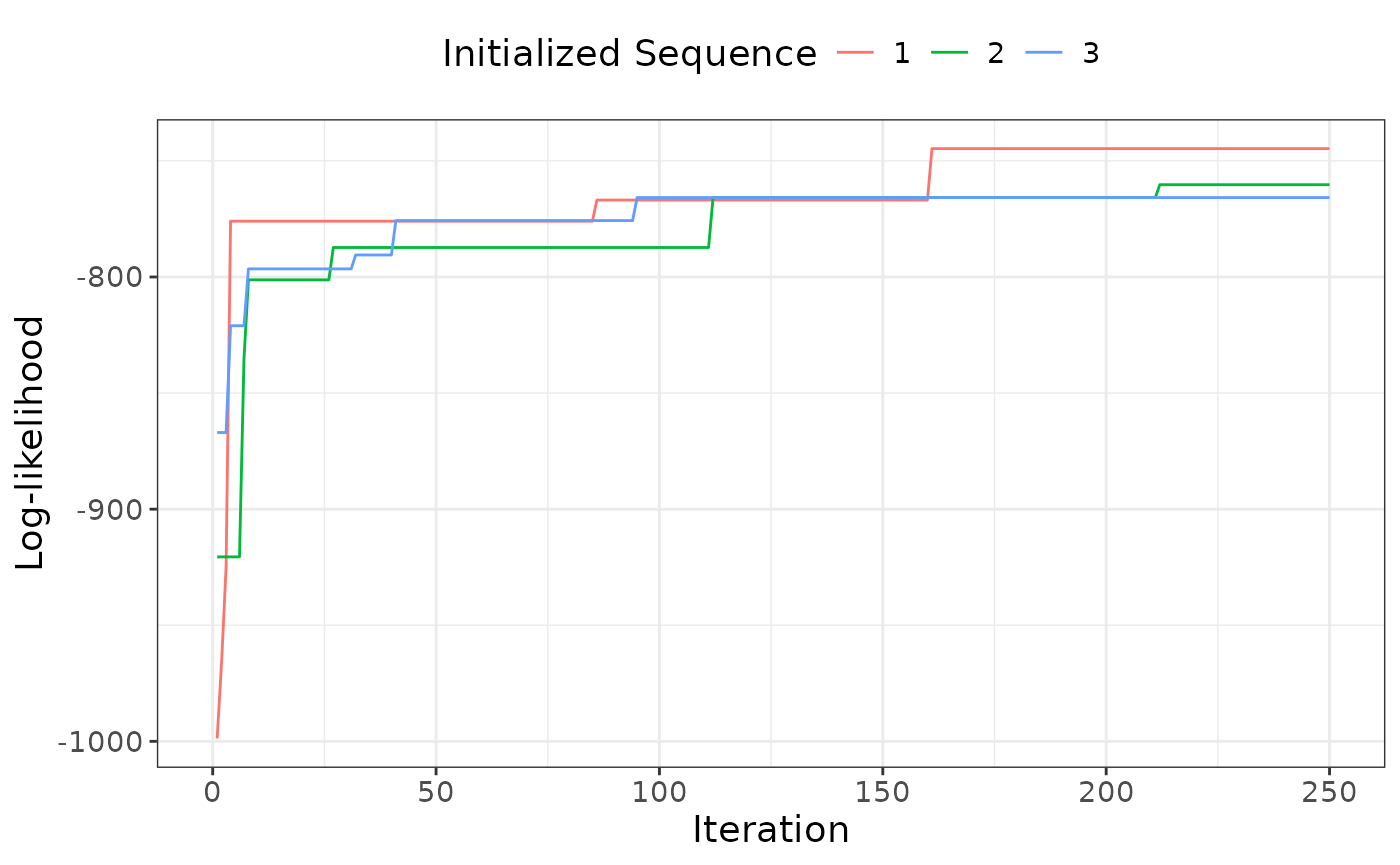
Bootstrap resamples
After fitting the model, we recommend constructing a positional variance diagram to visualize uncertainty in the maximum likelihood sequence. We provide the function bootstrap_seq to refit the model on a chosen number of resamples with replacement from the observed data. We recommend using at least 100 resamples. This function requires the same inputs as fit_STATIS with the additional argument z which is the total number of bootstrap resamples. The function returns a data frame where each row represents the sequence estimated for 1 resample from our observed data. We ran bootstrap_seq with TBData and our estimated sequence above. We present the first 6 rows of output. If our model fits the data well, we expect a majority of the bootstrap sequences to be the same as our maximum likelihood sequence. Like with fit_STATIS, in practice a mininum of 2000 iterations and 10 starting sequences should be used.
boot_seqs = bootstrap_seq(z=10,data=TBData[,c(3:8)], p_vec=c(.9,.9,.9,.9,.9,.9), clinical_info=measure_info, nstart=3,initial_iter= 250)

head(boot_seqs)
Positional variance diagram
After obtaining bootstrap sequences, we plot them in a positional variance diagram (PVD) to visualize the location and degree of uncertainty for our maximum likelihood sequence using the function pvd. The function requires a data frame of bootstrap sequences and the maximum likelihood sequence as input. The function returns a heatmap where the x-axis is disease class and the y axis is each clinical state in order of the maximum likelihood sequence. Each square in the plot represents the proportion of bootstrap sequences where each state occurs at each disease class. Darker colors indicate a higher proportion/degree of certainty. The disease class estimated for each state in the maximum likelihood sequence is outlined in black. We expect the highest proportion of bootstrap samples for each state to occur for the class where the state occurs in the maximum likelihood sequence.
We provide the PVD for the bootstrap samples for TBData below. A majority of our bootstrap sequences were equivalent to the maximum likelihood sequence. It is important to note that the x axis for the pvd ranges from 1 to 6 to account for the fact that some bootstrap sequences may have a different number of disease classes than our maximum likelihood estimate. The maximum number of classes is always equal to the total number of clinical states; for our example data set this is 6.
pvd(boot_seqs = boot_seqs, ml=model1$ml_seq)Predicted disease class
Our primary goal with using TB-STATIS is to understand TB disease severity is to obtain a predicted disease class for each individual in our sample. We include the function pred_class which calculates the disease class with greatest probability given an individual’s observed data and the estimated maximum likelihood sequence. Additionally, we include the function plot_class that generates a bar plot for the distribution of predicted disease class. We present the plot for predicted disease class for our example data set. We see the disease class distribution is approximately uniform which is expected since we used a uniform distribution to generate the true disease class. In practice, if we are using data from TB clinics, we would expect to see a left-skewed distribution where we disproportionately observe individuals with more severe disease.
Predicted disease class can be analyzed as an outcome as researchers are frequently interested in factors associated with increased disease severity. Disease class can also be use in secondary analysis as a predictor when modeling other outcomes of interest.
#save estimated sequence from model
est_seq=model1$ml_seq

#calculate predicted disease class
classdf <- pred_class(data=TBData[,c(3:8)], est_seq, c(.9,.9,.9,.9,.9,.9))

#print first rows of data frame that includes predicted disease class
head(classdf)
#>   X1 X2 X3 X4 X5 X6 pred_stage
#> 1  0  1  0  0  0  0          0
#> 2  0  1  0  0  0  1          1
#> 3  0  1  0  0  1  1          1
#> 4  1  1  1  1  1  1          4
#> 5  0  1  0  1  0  1          2
#> 6  0  1  0  1  0  1          2

#plot predicted disease class
plot_class(pred_class=classdf$pred_stage)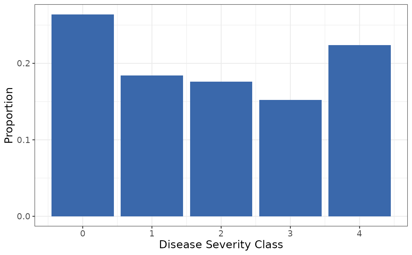
Conclusion
In this tutorial, we illustrated how to use the tbSTATIS package to analyze data to classify TB severity using clinical measures observed at time of TB diagnosis. With our example data set TBData, we demonstrated how to do the following:
- Visualize clinical states
- Estimate the disease sequence
- Check the likelihood ascent plot for model convergence
- Generate bootstrap resamples and plot the positional variance
diagram to visualize uncertainty
- Calculate predicted disease class and plot the distribution
We conclude with some considerations and best practices for practitioners wanting to analyze data with tbSTATIS.
- The method we present was motivated by prior work in event-based modeling that was largely used to understand the progression of neurodegenerative diseases. When applying our method to TB data, we are not concerned with drawing conclusions about disease progression. We are using TB-STATIS to classify disease severity at time of diagnosis only.
- Fitting TB-STATIS requires collecting data that is strongly
correlated with disease severity. For TB disease, we include measures
that are well-established as predictors of treatment outcome and TB
sterilization (cavitation, smear status, etc) and that are often used
individually to stratify patients into categories that represent
advanced versus early disease.
- Fitting TB-STATIS also requires the user to input a value for p for
each clinical state included in the model. With TB diagnostic measures
and chest x-ray data, we expect p to be close to 1. The user should
always run a sensitivity analysis where they decrease p from their
original model fit to assess the sensitivity of the maximum likelihood
sequence to p.
- In theory we can include as many clinical measures and states as
possible when fitting TB-STATIS. The performance of the method decreases
with smaller sample sizes, a larger number of clinical states, and lower
values of p for each state. We should consider these factors when
choosing data to estimate the model. An additional challenge includes
non-convergence when estimating the maximum likelihood sequence. This
can potentially be mitigated by increasing the number of iterations
during estimation but comes at the cost of increased computation time.
The user should always check the likelihood ascent plot to determine if
convergence was reached with the chosen number of iterations.
- Finally, it is always best to visualize the observed data before fitting the model which also provides the user with an expected disease sequence to compare to the maximum likelihood estimate. This is especially helpful if we are using TB-STATIS as a hypothesis generating tool and do not already have a strong understanding about disease sequence or severity.